Abbiocco Restaurant Branding
Art Direction:
Bryan Satalino
Branding, Illustration, Typography
Abbiocco is a brand identity for a modern Roman restaurant reminiscent of the old–world kingdoms of Italy, but with a playful feel incorporating the most famous Romanesco words and phrases into the menu and restaurant decor. The word ‘Abbiocco’ comes from the Roman dialect, and the word’s meaning is what shapes the look and feel of the restaurant.
Abbiocco is a Romanesco word meaning the sensation of sleepiness after a satisfying meal. The restaurant’s branding incorporates cultural and linguistic education into the sharing of a meal.
In creating a linguistically-focused restaurant, I realized the typeface would be important and should relate to the aesthetic and usage I needed it for. I wanted to highlight certain words and phrases in the dialect, which all needed to be done with the same treatment as the restaurant name, since it too was a Roman dialect word.

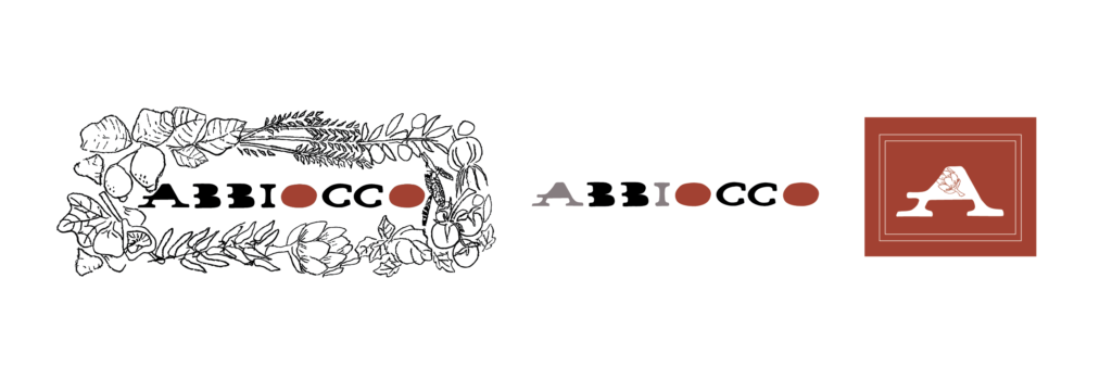
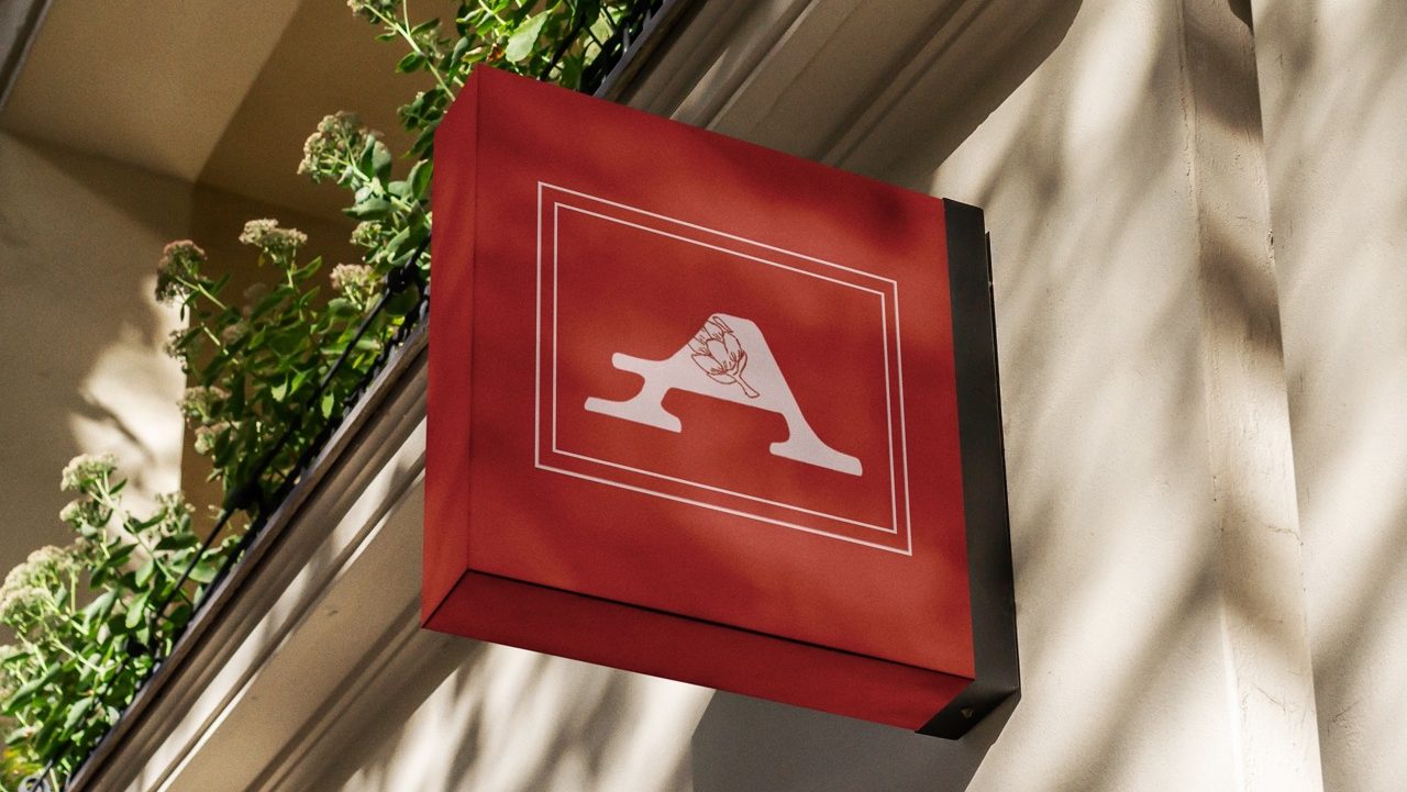
LOGO CREATION
I tried going in several different directions with my logo sketches. First I tried just playing with type. But I also wanted to see what it might look like with old world imagery, so I incorporated some symbols from the classic Italian card game, “Scopa”, since it uses court cards. In the ended I landed on the idea of simply combining food and type with a wreath of fresh food surrounding the restaurant.
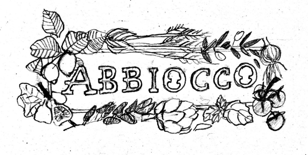

I was drawn to the wreath of fresh veggies and herbs, because fresh food is integral to Italian cooking. I liked the hand drawn feel because it added more of the old-world feel. Italian cooking places an importance on only adding what is necessary for the dish, so that each ingredient is highlighted and can be savored to the fullest extent. I also liked the idea of hand-making my own type, as a nod to hand carved ancient Roman capitals.
TYPOGRAPHY
Through the logo process I was able to design a typeface for my restaurant. The design is meant to stray away from the Roman style capitals I wanted to embrace a friendlier approach that still felt just as loud as Roman capitals, but more exaggerative, personable, and reminiscent of a that feeling of having a full-belly of food.

- No counters
- Slab serif
- Wide spacing
- Humanist
- Round corners
- Imprecise

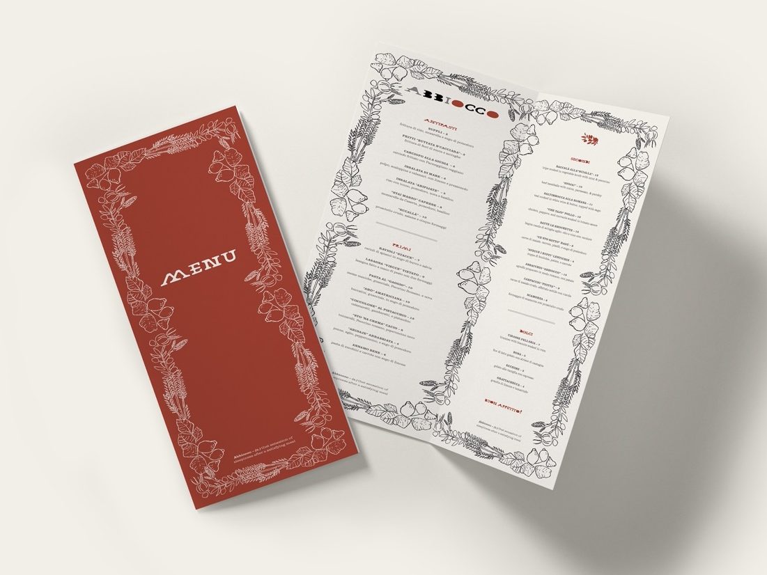
MENU
Probably my favorite part of this project was the menu. I wanted something elegant, yet still holding onto the personality of Abbiocco. After looking at a variety of Italian restaurant menus from real restaurants in Trastevere, Philadelphia, and the mainline, I wanted mine to have a more illustrative feel that made viewing more fun. I incorporated the wreath pattern around the border of the menu, and added pops of the brick red, to create interest, drawing the eye around the page.

The menu process involved continual revision. Many of my first ideas ended up falling into the stereotypical Italian restaurant realm. I wanted the focus to be the type, so I experimented with different ways it could “jump out” at the viewer, adding a liveliness to the words. I ended up with a paired down color scheme, which helped to elevate it and allow the type to stand out.

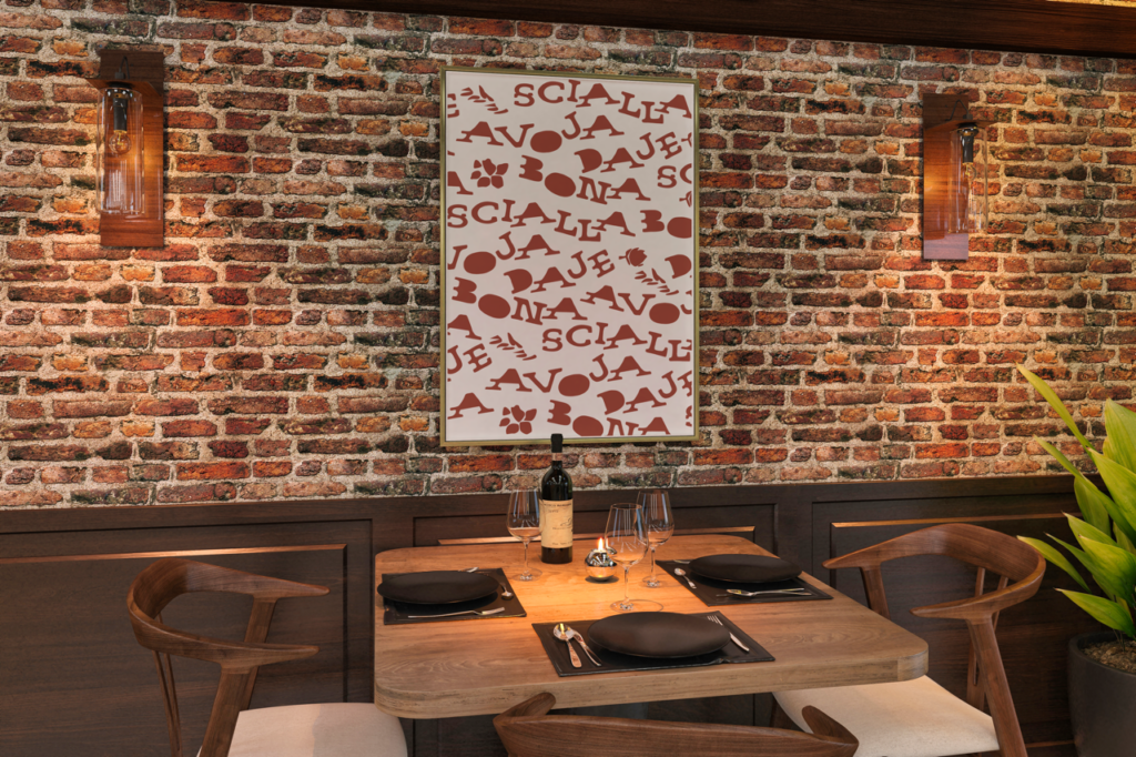
COLLATERAL
As a final touch to Abbiocco’s identity I designed a wine label and stamp. Using the developed brand identity I created through the logo and menu was able to use the same type treatment to the designs, and bring further attention to the roman phrases.

REFLECTION
After creating this brand, I have to say that I feel satisfied. I had been looking forward to this specific project for a while, and I’m proud that I was able to create something meaningful to me, allowing me to share something I learned about my time in Italy in a creative way that hopefully brings more awareness about Italian culture through food.